 (Image via
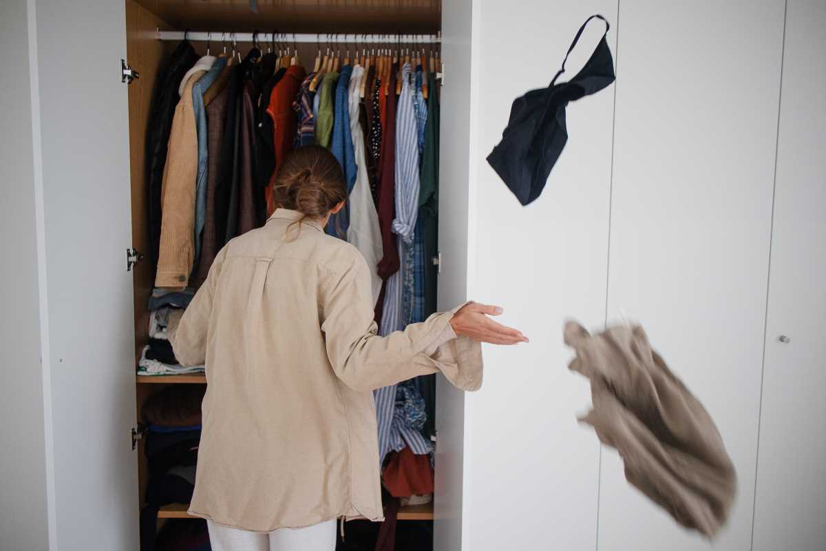
When selling your home, creating an emotional connection with buyers is one of the most effective strategies for closing the deal. How do you make that connection? Believe it or not, the answer could be as simple as the colors you choose!
Color is more than just decoration; it’s a powerful psychological tool that can influence how people feel and perceive a space from the moment they walk in. When staged thoughtfully, your choice of colors can make rooms feel larger, cozier, more inviting, and even more functional.
This guide will unpack the psychology of color and how to use it strategically when staging your home to appeal to potential buyers. With actionable tips, room-specific ideas, and examples of winning color palettes, your home could become the standout buyers didn’t know they were waiting for.
Why Color Psychology Matters in Staging
When done right, staging transforms your home into a space that helps buyers envision their lives there. To create this emotional pull, you need to balance visual appeal with mood-setting ambiance. That’s where color psychology comes in.
Colors are proven to evoke emotions and shape perceptions. A bright yellow kitchen can feel cheerful and warm, while a muted gray living room helps viewers feel calm and relaxed. The right colors can even highlight architectural features and define a home’s flow, making it feel well-put-together and easy to love.
By understanding how colors impact human emotions, you can use staging to guide a buyer’s experience—from creating an inviting first impression in the entryway to leaving them with feelings of comfort in the bedroom.
The Best Colors for Different Rooms
Just as each room has a unique purpose in a home, each has an ideal color palette to align with buyer expectations and emotional responses. Here’s a breakdown of which tones work best in key areas and why.
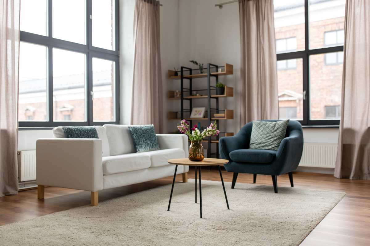
Living Room
The living room is a central gathering space, so it should feel warm and welcoming while maintaining flexibility for a broad range of tastes.
Colors to Try:
- Beige or Taupe: Neutral shades feel cozy and timeless, allowing buyers to imagine their own furniture fitting seamlessly into the space.
- Soft Gray: Grays with warm undertones give the space a modern, polished look without feeling cold.
- Muted Green: Sage or olive hues introduce a subtle connection to nature that feels soothing and refreshing.
Pro Tip: Pair neutral walls with textured accents, like throw pillows or rugs, to keep the space visually engaging without overwhelming the room.
Kitchen
Kitchens are often seen as the heart of the home. The right colors in this space should evoke feelings of energy, cleanliness, and vibrancy.
Colors to Try:
- White or Off-White: Classic and clean, these shades maximize light and make spaces feel roomy.
- Soft Yellow: Adds a cheerful vibe that feels sunny and warm, especially in homes with less natural light.
- Light Blue or Aqua: These tones can create a fresh, crisp feel that's ideal for any kitchen style.
Pro Tip: Avoid dark or overly bold colors in kitchens, which can make the space feel smaller and less functional.
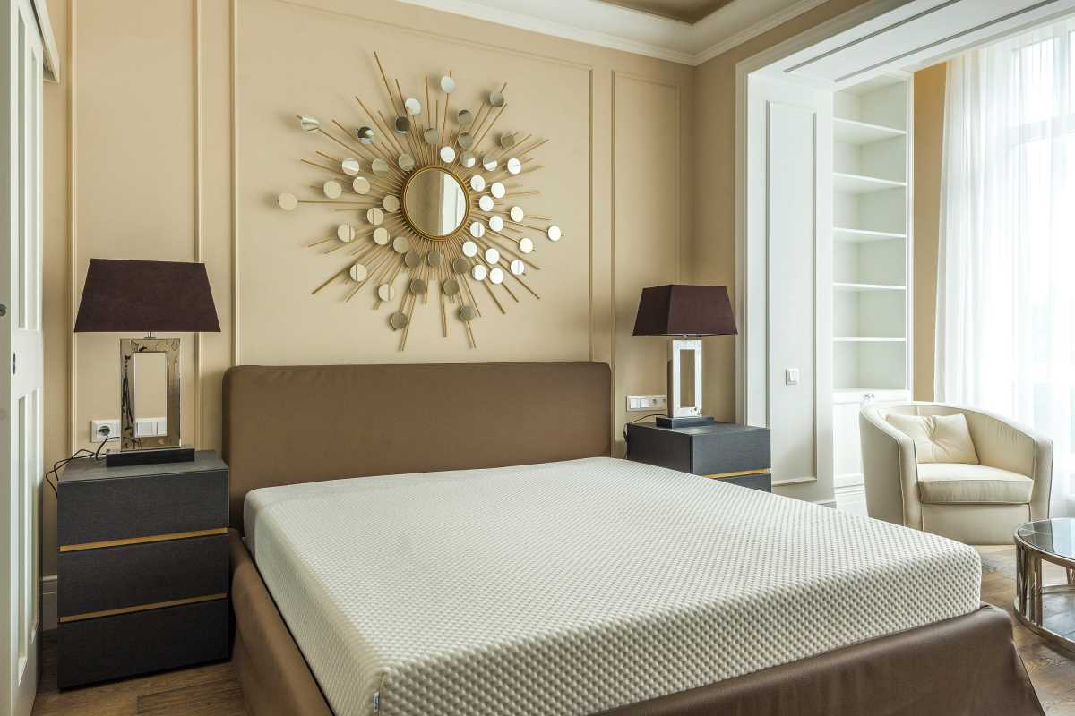
Bedrooms
Bedrooms should feel like a sanctuary. Calming colors are your best bet for creating spaces where buyers can imagine unwinding after a long day.
Colors to Try:
- Soft Blue or Pale Gray: These cool tones promote relaxation and have a universally appealing elegance.
- Lavender: A subtle lavender hue offers a calming effect while adding a touch of personality.
- Light Beige or Cream: Perfect for a serene, neutral retreat that’s easy for buyers to personalize.
Pro Tip: Use cozy layers like plush throws or accent pillows to play up the comfort factor.
Bathrooms
A clean, spa-like vibe works wonders in bathrooms. Buyers shouldn’t just see a functional space; they should feel like they’re stepping into a personal oasis.
Colors to Try:
- White or Soft Gray: Conveys cleanliness and makes smaller bathrooms feel spacious.
- Light Green or Cool Blue: These hues channel the tranquility of nature or water, ideal for a calming effect.
- Pale Pink or Peach: Add warmth and softness in guest bathrooms or powder rooms.
Pro Tip: Accentuate your color choices with fresh towels, candles, or greenery for an inviting, luxury touch.
Home Office
With remote work on the rise, a well-staged home office is a huge selling point. The color palette here should balance focus with inspiration.
Colors to Try:
- Muted Blues or Greens: These colors help improve concentration and creativity.
- Soft Neutral Tones: Light grays, taupes, or off-whites create a professional atmosphere without feeling stark.
- Warm Earth Tones: Rust, terracotta, or light browns promote energy and keep the space grounded.
Pro Tip: Keep the decor minimalist to avoid distractions from the workspace’s functionality.
Entryways and Hallways
Entryways set the tone for the entire home, and hallways act as a transition. Neutral tones work best here to keep things cohesive and welcoming.
Colors to Try:
- Light Gray or Greige: Create continuity between rooms while maintaining neutral charm.
- Pale Yellow or Cream: Add warmth and brighten up narrow halls.
- Soft White: A clean, timeless choice that reflects plenty of light, making spaces feel open and inviting.
Pro Tip: Use mirrors in the entryway to amplify light and add a touch of elegance.
Creating a Cohesive Color Palette
To make your staging feel intentional and high-end, it’s important to create a cohesive color palette throughout the home. Here’s how to achieve consistency while giving each space its unique character:
- Stick to a Core Palette: Choose 2-3 primary neutral shades to use across your main living spaces. For example, light gray walls with white trim and navy accents create balance without being boring.
- Use Accent Colors Sparingly: Incorporate pops of muted blues, greens, or even warm terracotta as accents in pillows, rugs, or decor. Keep bold hues contained to smaller, less permanent items.
- Think About Transitions: When choosing colors, consider how rooms connect visually. A dramatic change from one room to the next can disrupt the flow of the home, while gradual transitions maintain harmony.
- Highlight Focal Points: Accent walls or color-blocked features work best when they emphasize natural focal points like fireplaces, built-ins, or large windows.
Tips for Success
Whether you’re staging for a quick sale or enhancing your living space for yourself, a few thoughtful steps make all the difference:
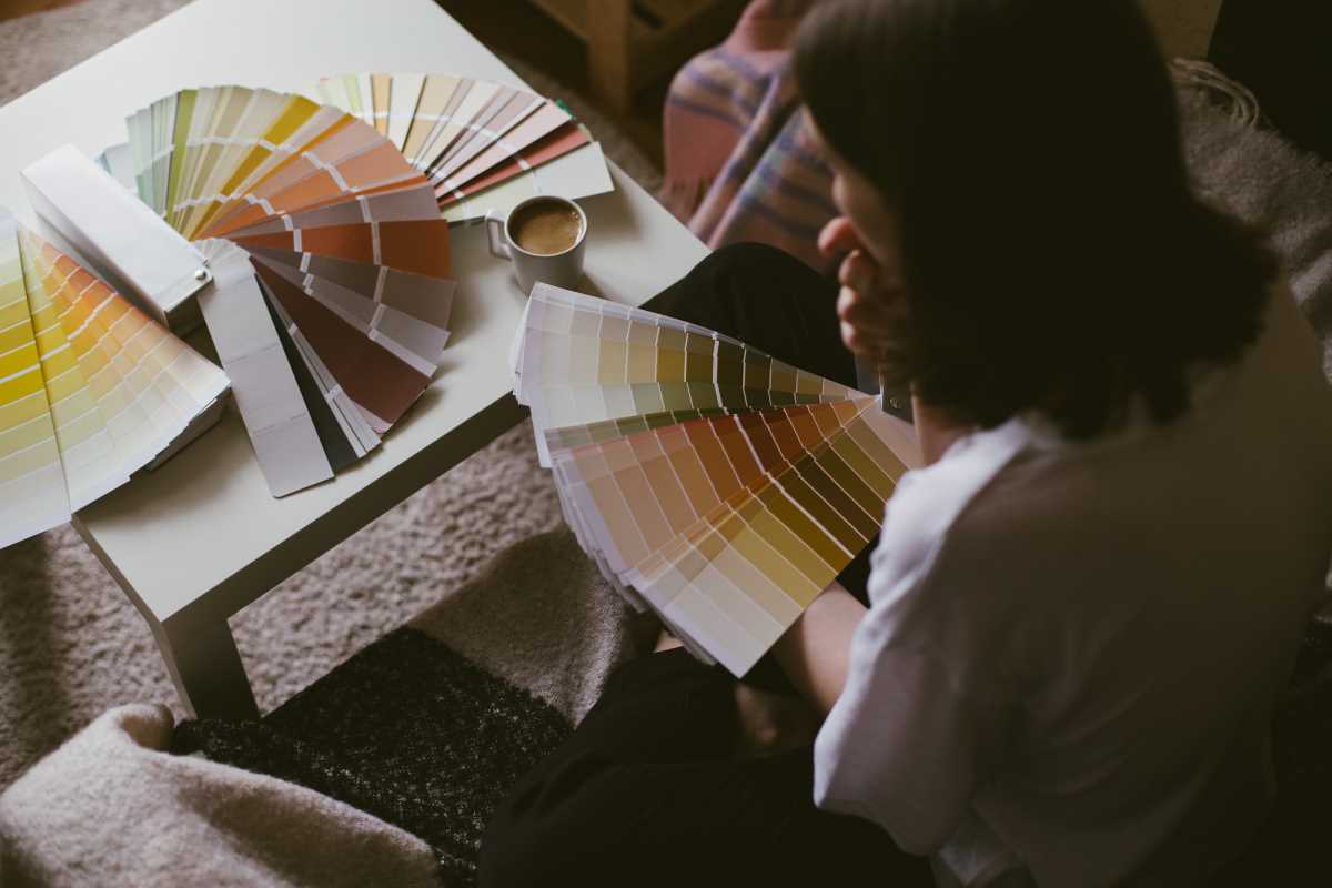
- Test Colors in Natural Light: Lighting can dramatically impact how colors appear. Always test paint swatches on the wall and observe them at different times of day.
- Avoid Trend Overload: While it’s helpful to stay current, timeless shades are better for broad appeal.
- Don’t Skimp on Paint Quality: High-quality paint gives walls a smooth, professional finish that won’t go unnoticed by buyers.
Staging spaces with the psychology of color in mind allows you to create environments that buyers emotionally connect to. Neutral tones set a welcoming foundation, soothing blues and greens provide calm, and cheerful yellows or balanced grays ensure timeless appeal.